
Online giving continues to grow as a central pillar of digital fundraising—but many nonprofits still struggle to convert website traffic into actual gifts due to poor user experience (UX) and ineffective donation button placement. A poorly positioned donation button not only frustrates would-be donors but also undermines your entire digital fundraising strategy. Drawing insights from UX and fundraising best practices, this article walks through how strategic donation button placement can boost gifts automatically while eliminating friction in the donor journey.
Why Donation Button Placement Is a Game Changer for Digital Fundraising
Even with compelling stories and powerful missions, how and where you place your donation button can make the difference between a visitor clicking “Give Now” and clicking away entirely. When the donation button is easy to find and easy to use, online giving rates improve—which means more gifts coming in with less friction.
How Donors Behave Online (Understanding the UX Behind the Click)
To boost gifts automatically, you must first understand donor behavior:
User attention is fleeting
Online donors make split-second decisions when landing on a website. If a donation button is hard to find, visually weak, or buried in navigation, attention drops instantly. Clear, prominent donation button placement helps capture intent quickly, preventing drop-offs and ensuring donors act before distractions pull them away.
Mobile dominates giving traffic
A growing majority of online giving now happens on mobile devices, where screen space and usability matter most. Donation buttons that are too small, poorly positioned, or not optimized for touch frustrate users. Mobile-friendly button placement ensures donors can give easily, anywhere, without unnecessary scrolling or zooming.
Friction kills conversions
Every extra step between clicking “Donate Now” and completing a gift introduces friction. Long forms, page redirects, or unclear next actions cause donor hesitation. Streamlined donation button placement that leads directly to simple, fast forms boosts gifts automatically by removing barriers and maintaining donor momentum.
Strategic Donation Button Placement Essentials
The donation button placement that boosts gifts automatically isn’t random—it’s rooted in UX principles and real donor behavior.
Sticky Header Buttons (Never Missed)
A sticky “Donate” button in the website header remains visible as users scroll, ensuring the giving option is always accessible. This eliminates friction caused by searching for where to give and captures donor intent at any moment, significantly improving conversion rates throughout longer pages.
Above the Fold
Placing donation buttons above the fold ensures donors see the call to action immediately upon landing on a page. This prime placement captures attention before distractions set in, guiding visitors toward giving early and reducing the risk of missed opportunities due to scrolling fatigue or content overload.
After Emotional Impact Content
Donation buttons placed directly after emotionally compelling content—such as stories, testimonials, or impact videos—capitalize on heightened donor empathy. When visitors feel inspired or moved, immediate access to a donate button allows them to act on emotion, which helps boost gifts automatically and naturally.
Repeating Buttons Throughout Pages
Relying on a single donation button limits conversion opportunities. Repeating buttons at logical points—mid-page, after key sections, and at the footer—ensures donors can give whenever motivation strikes. Strategic repetition improves usability and supports different reading behaviors without overwhelming the user experience.
Visual Design Principles for Donation Buttons
Even perfectly placed buttons can fail if their design doesn’t invite clicks.
Use High-Contrast Colors

High-contrast donation buttons stand out from surrounding content, making them instantly noticeable to visitors. When buttons blend into the page design, donors may overlook them entirely. Strategic color contrast improves visibility, reduces cognitive effort, and guides users naturally toward taking action without disrupting the overall visual experience.
Make Buttons Thumb-Friendly
Mobile donors rely on quick, effortless interactions. Donation buttons that are large, well-spaced, and easy to tap with a thumb reduce frustration and accidental clicks. Thumb-friendly sizing improves accessibility and usability, ensuring that mobile users can complete gifts smoothly—an essential factor in boosting online giving conversions.
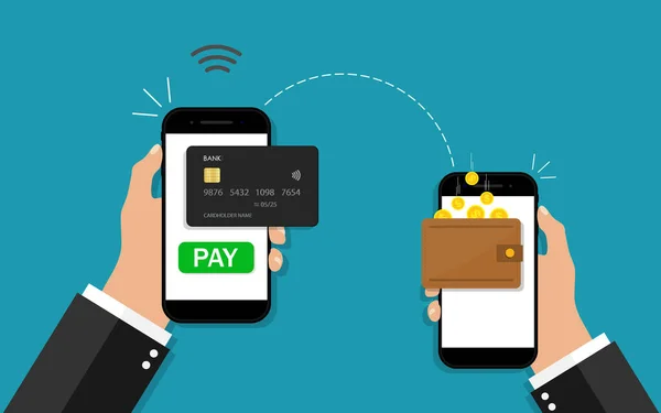
Clear and Compelling CTA Text
Effective call-to-action text removes uncertainty by clearly stating what will happen next. Phrases like “Donate Now” or “Give Today” are direct, familiar, and emotionally motivating. Clear CTA language paired with strong button placement reassures donors, builds confidence, and encourages immediate engagement with the giving process.
UX Best Practices That Complement Donation Button Placement
Effective donation button placement goes hand-in-hand with overall UX design. Here’s how to support placement with thoughtful UX:
Streamline the Donation Flow
A smooth donation flow keeps donors focused and motivated. Short forms, minimal required fields, and fast page loading reduce frustration and abandonment. When clicking a donation button leads directly to a simple, intuitive giving process, donors are far more likely to complete their gift without hesitation or distraction.
Mobile-Optimized Giving
Mobile-optimized giving is no longer optional—it’s essential. Donation buttons and forms must resize correctly, load quickly, and function flawlessly on all devices. Poor mobile UX, such as broken layouts or slow pages, drives donors away. Seamless mobile experiences directly support higher online giving and stronger conversion rates.
Trust Signals
Trust signals reassure donors that their personal and financial information is secure. Visible SSL badges, privacy statements, and brief testimonials placed near the donation button reduce anxiety. When donors feel safe and confident at the moment of giving, conversions increase and hesitation is significantly reduced.
Placement Opportunities Beyond the Website
To boost gifts automatically, extend donation button placement across all digital channels:
Email Campaigns
Embedding clear, prominent donation buttons within fundraising emails shortens the path from inspiration to action. When donors can click directly from an email to a streamlined giving page, click-through rates improve. Strategic button placement within email content captures attention and turns engaged readers into immediate contributors.
Social Media Integration
Social media platforms like Facebook and Instagram allow nonprofits to place native donate buttons directly on posts and profiles. This removes extra steps and keeps donors within the platform they’re already using. Simplified in-app giving experiences increase participation and help boost gifts automatically through reduced friction.
Digital Ads and Landing Pages
Donation buttons on paid ads and campaign landing pages must be instantly clear and visually dominant. Strong call-to-action placement reduces confusion and directs users immediately toward giving. When ad messaging aligns perfectly with landing page donation buttons, conversion rates increase and ad spend becomes more efficient.
QR Codes for Offline Donors

QR codes bridge offline and online giving by directing donors from print materials to mobile-friendly donation pages. When QR codes lead straight to a visible donate button, they eliminate manual URL entry and encourage spontaneous giving, especially at events, mail campaigns, or in-person outreach settings.
A/B Testing for Placement Success
No two donor audiences behave exactly the same, which is why A/B testing is essential for optimizing donation button placement. By testing different button locations, colors, sizes, and call-to-action text, nonprofits can identify which combinations resonate most with their supporters. A/B testing reveals how small UX changes impact donor behavior, helping organizations understand what truly drives clicks and completed gifts. Tracking key metrics such as click-through rates, form abandonment, and completed donations allows teams to continuously refine their strategy. Over time, this data-driven approach ensures donation button placement boosts gifts automatically and consistently across digital fundraising campaigns.
Avoiding UX Pitfalls That Kill Online Giving
Even small UX missteps can drastically reduce donations:
Hidden Buttons
Hidden donation buttons are one of the most damaging UX mistakes nonprofits make. If donors have to search for how to give, motivation quickly fades. Prioritizing visibility over overly minimal design ensures the donate button is instantly recognizable, guiding users smoothly toward giving without confusion or unnecessary effort.
Confusing Navigation
Complex menus and unclear navigation paths frustrate donors and interrupt the giving mindset. When visitors struggle to understand where to click next, they often abandon the process altogether. Intuitive navigation paired with clear donation button placement helps donors move confidently from interest to action without cognitive overload.
Too Many Steps
Every additional step between clicking a donation button and receiving a confirmation increases the risk of abandonment. Long forms, multiple redirects, or unnecessary confirmations break donor momentum. Optimizing for minimal friction keeps the giving process fast and simple, allowing donors to complete gifts while motivation is still high.
Also read:Why Your Donation Page Needs A/B Testing
Wrap-Up: Make Donation Button Placement Work for You
Donation button placement isn’t an afterthought—it’s a strategic lever that can boost gifts automatically when backed by strong UX principles. By making your donate button:
✅ Highly visible and repeatable
✅ Contextually placed at points of emotional engagement
✅ Mobile-ready and visually contrasting
✅ Integrated across channels
—you create a friction-free giving experience that converts more visitors into donors. Prioritizing UX everywhere the donate button appears ensures that every gift is just one intuitive click away.
10 FAQs About Donation Button Placement & Digital Fundraising
- Why does donation button placement matter?
Placement affects visibility and usability, directly impacting how many visitors click to give. - Where should I put my donate button for best results?
Top headers, mid-page after content, footers, and sticky placements all improve visibility. - How does mobile impact donation button design?
Mobile users need larger, thumb-friendly buttons with responsive layouts. - Should donation buttons be repeated on a page?
Yes—multiple touchpoints increase chances visitors convert. - What text should donation buttons use?
Action-oriented CTA text like “Donate Now” or “Give Today” works best. - Does button color affect giving?
Yes—high contrast increases visibility, though testing helps find what works best. - Can social media donation buttons help?
Absolutely—platform-native donate buttons streamline giving without redirects. - How do UX principles help online giving?
Good UX reduces friction and builds trust, leading to higher conversions. - What common UX mistakes reduce donations?
Hidden buttons, complex navigation, and long forms all reduce giving. - Is A/B testing worth it for donations? Yes—testing lets you find the most effective placement and CTA variations.